
Technically it's the easiest object to apply a texture mapping. Most of the cloaks are rectangular or trapezoidal, with some bending here and there, but the core object remains a low-polygon rectangle type. Since the form is so simple applying a texture is quite easy and doesn't need much preproduction work so when it's applied to the object it looks correct (you need to stretch the texture to adapt it to the form of the object. Rounder objects like heads need more work so when the skin texture is applied it doesn't look kinky).

As your character progresses you'll start getting longer cloaks, capes or mantles. First ones, white-quality and still without any stat are still too short to be called cloaks. Again it seems you have a handtowel tied on your back. The first greens you'll get will also be still short and simple in design.
As time passes your character will get longer cloaks but unfortunately not better in design. Vanilla WoW have simple designs, almost patternless. Some cases are really painful, like getting a blue quality cloak named Tigerstrike Mantle... that even doesn't has tiger stripes on it so you can't avoid feeling deceived when you get it.
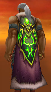
And then we reach the Wrath of the Lich King expansion were things haven't improved much. First endgame cloaks from Naxxramas are hideous. Aged Winter Cloak? Horrible colour combination. Cloak of Armed Strife? Come on! Not only has again a more than arguably colour choice but that "skull" motiff on it like Superman's cloak it's just a big design fail. And after all the patches few cloaks are worth mentioning, like Aetha's Intensity. That's a cool looking cloak! Maybe too ellaborate, but at least is worth displaying it in your character.
 So we have two expansions and several content patches but still the major part of cloaks look poor. Then you see cloaks from other games like LOTRO, just like these ones and then you can't help but start wishing the designers get banged in the head with a mallet. Because seeing what happened with swords and other gear I don't expect things to improve. Even with the overcloaks: it's like adding an old short cloak over the current one, applying the motiff to the upper part of your current cloak. So if you're not really into tabards (aside from the reputation gain) overcloaks won't be your game too.
So here's my calls to Blizzard designers: please improve cloak designs. Forms are ok (you can add more complexity like how it bends and moves), but patterns need more work. And you don't really need to add complex designs like the Drape of the Violet Tower. Check animal hides and create a good tigerskin cloak, not that Tigerstrike Mantle.

 Kurnak
 Turnak
 Vurnak
 Murnak
 Jurnak
 Surnak
 Durnak
 Lorathiel
 Grimbol
 Valaak

"PUBLICADO POR KURNAK" hehe, guess you are starting to show national colours these days :D
ReplyDeleteAnyways, regarding swords, if you look at mmo-champ today (http://www.mmo-champion.com/content/1891-Raid-Weapons-Models-Mulgore-Video ) I think you'll agree that swords look way better than both axes, maces and daggers. So I guess swords are getting some looooove
Something must be wrong since I have selected english as language, but the other day added the social network icons and seems that screwed the configuration. Odd enough... I cna't find any other option for languages than the main one. Anyway I've alway's seen all blog-related messages in yours in danish.
ReplyDeleteYes, I saw the weapons this morning and I'm pleased. The design is following the lines of the last content in Wrath but with hammers and dragons designs. And they look good, but I want to see the green items. While 90% or more of the epic stuff looks great, the opposite happens for green/blue gear. They look ugly and lacking colour (but let's not go back to TBC times!)
So thumbs up for the new swords (and other weapons), but I'm still cautious about the looking of the new green stuff. Even if they're just greens, to be replaced by blues from dungeons, they deserve some design love too.
Ah found it :) Now it's in english again, it was that new thing, it adds more options and texts can be customised totally, but it's strange doesn't offer a language selector to do it automatically, you have to type it all.
ReplyDeleteBtw... who saw this http://static.mmo-champion.com/mmoc/images/news/2010/july/thickbox/sword_2h_bwdraid.jpg and thought "Ashkandi v2.0"? Well, since Ashkandi is called "Greatsword of the Brotherhood", it should be related.
ReplyDeleteNever noticed my was wrong too :D Changed!
ReplyDelete-and now that you mention it, it does look like Ashkandi. hummm
Sexy cloaks are an important part of being an adventurer, dammit. Once Spinks posted those LOTRO cloaks I was so jealous. My current cloak looks like a carpet :/
ReplyDelete